
Preserving Promises: Designing the Tribal Treaties Database
Overview
The Tribal Treaties Database provides an accessible portal to explore treaties, agreements, and other historical documents that have shaped relationships between tribal nations and the United States. These treaties represent pivotal moments in history where rights were negotiated, promises made, and the course of lives and nations forever altered.
This database serves as a valuable resource, encouraging users to understand the profound significance of these documents and acknowledge their historical and ongoing impacts on the sovereignty and rights of Native American tribes.
Methodologies
User interviews and usability testing were done to inform design decisions between iterations. Doing this helped determine which designs I should share with my team.
Role & Duration
-
Solo UX/UI Designer (Freelance)
-
Ensure usability & create a functional design system.
-
February - November 2023
Client
-
Oklahoma State University Libraries
Team
-
Juliana Nykolaiszyn, Project Manager
-
Megan Macken, Project Manager
-
Roy Degler, Developer
-
Nikhil Motwani, Developer
-
Carissa Wilson, UX/UI Designer
The Problem
Although functional, the database felt incomplete and unreliable due to a lack of design elements. As the site evolved, the need for a dedicated UX/UI designer became clear. My role was to enhance the visual design, develop a cohesive brand, and improve the usability & information hierarchy to elevate the overall user experience.
Heuristic Evaluation & Analyzing the Existing Design
To identify usability gaps and areas for improvement, I analyzed the existing design using Nielsen Norman Group’s 10 Usability Heuristics, focusing particularly on Guideline 6: Recognition Rather Than Recall. This evaluation provided a usability-focused perspective, helping me pinpoint issues that hindered the user experience, and identify elements that worked well. The process not only familiarized me with the database, but also guided my design decisions.

Issues
-
The desktop version relies solely on a hamburger menu, hiding important navigation options and adding extra clicks.
-
The hamburger menu lacks hierarchy, presenting all users with a text-heavy list that feels overwhelming.
-
Key information is located in the footer, making it harder for users to find essential details.
-
The absence of a central headline leaves users without a clear introduction to the database.
-
Long, unstructured lists make it difficult for users to locate specific information efficiently.
Recommendations
-
Make key navigation immediately accessibly by providing a visible navigation bar on the desktop version.
-
Align with standard design conventions and use a hamburger menu only for mobile devices.
-
Reserve the footer for non-essential details and secondary information.
-
Add a welcoming central headline to communicate the database's purpose at a glance.
-
Break up lengthy lists into more digestible sections to improve usability and clarity.
Key Goals
From discussions with Juliana and Megan, my project managers who guided the development of this database, I learned the primary goals were:
Navigation
A prominent and accessible search bar, supported by intuitive design to make finding information effortless.
Clean Design
A colorful yet uncluttered aesthetic, conveying a sense of completeness and reliability.
Equity
A balanced approach to representation, ensuring no tribal nation was highlighted over others.
Secondary Research
Gaining a better understanding of history, treaties, and databases.
Research is an essential part of the design process, and I was eager to learn more. I explored the history of treaties between tribal nations and the U.S., learning that some tribal leaders used fingerprints in place of signatures. This historical detail inspired a design feature we incorporated into the landing page to emphasize its significance.
I also explored other databases for inspiration. While most were straightforward in design, elements like a prominent search bar, multiple browsing methods, clear sections, and a brief self-introduction stood out as effective features, which I adapted for this project.

Understanding Our Users
Through conversations with Juliana and Megan, I learned that users would range from tribal leaders and lawyers to students and educators. The platform needed to feel reliable for experts while remaining approachable for general users.
Multiple Search Options
A prominent search bar and filters for various needs.
Clear Structure
Distinct sections for easy navigation.
Accessible Icons and Text
Icons paired with text for accessibility.
Welcoming Feedback
A contact section to encourage user interaction.
Landing Page Conceptualization
With a solid understanding of the project, I quickly sketched three homepage layouts and refined them in Figma. The team favored a left-aligned design with a large central search bar. They also appreciated the “Browse By” and “Partners” sections, looking forward to new icons. While they liked the “About” section, they requested a more condensed version, which I adjusted accordingly. The “Contact Us” section was well-received as a way to encourage user feedback.

Medium Fidelity Mockups
Since my team approved a landing page, I started creating medium fidelity mockups, which allowed for a better understanding of the overall design while still leaving room for iteration. I started experimenting with colors, imagery, iconography, and typography without focusing too much on defining the final design.
Shifting from simple structural elements to a more detailed representation of the landing page helped my team and I get a glimpse of how it might look as a finished product.
During this process, I tested my initial designs with some trusted folks before sharing them with my team. After that, I would implement the feedback from my team, and so on. As an iterative process, we kept tweaking until eventually we came up with a satisfactory design.

Breaking Through Design Challenges & Learning Curves
Pivoting the Design
After several mockups, my team tentatively selected a design, but something still felt off—it didn’t seem robust enough to support the entire database, and it felt outdated. I took a step back and gave myself time to experiment freely with the design elements. By the end of the day, a stronger, more fitting design emerged, which my team fully approved with only minor adjustments. With the landing page mostly mapped out, we moved on to confirming the typography, colors, and iconography before moving on to the secondary page design.

Auto Layout & Responsive Screen Learning Curve
This being my first large-scale UX project, I initially overlooked the need for responsive screens. Attempting to learn auto layout proved difficult, and to save time, I ended up designing each screen individually. While this worked, I was frustrated by the challenge of mastering auto layout, and have since taken moonlearning courses to help me get it down, which have been enormously helpful!

Working with Developers
As this was my first major UX project, we waited to involve developers until the foundational design was almost finalized. Once secondary pages were near completion, we collaborated closely, communicating regularly on Slack and meetings to ensure everything was implemented correctly.
The Solution
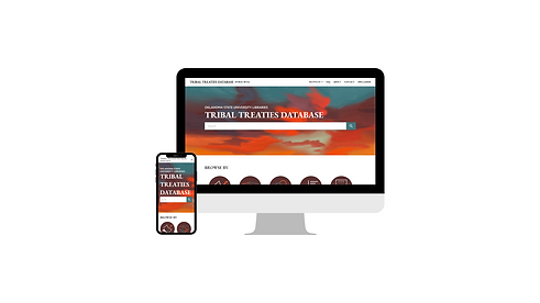
This layout aligns with the wireframe Juliana and Megan had initially approved. It’s clean, and shows off an easy to use search bar highlighted at the top, with another option to search in the “Browse By” section immediately following the search bar.

Hero Section: Start Your Journey Here
The hero section greets users with a warm, vivid sunset image that conveys a sense of trust and approachability. The database name is prominently displayed, while a central search bar enables users to begin exploring immediately. Complementary navigation options above and below the search bar provide clear, accessible pathways for finding information, enhancing usability through multiple search methods.
Browse By Section: Navigate with Ease
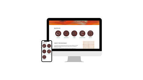
The “Browse by” section offers users an intuitive alternative for navigating the database, catering to diverse search preferences. Each category is paired with an icon inspired by the original beta database and colored to complement the sunset imagery. Coupled with descriptive text, these icons provide clear guidance on the types of information available, making the database approachable for both focused searches and casual exploration.
About Section: Learn More About Us
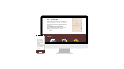
A prominently displayed treaty on the landing page highlights the historical significance of these documents and the purpose of the database. Users can also read a brief overview of the database, with a “Learn More” button for those interested in exploring further.
Partners Section: Meet Our Partners
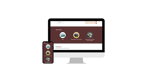
The Partners section highlights the organizations that contributed to the creation of the database, offering a nod of recognition and adding credibility to the project. Featuring these partners prominently also reinforces the collaborative effort behind the database.
Contact Section: Send Us Your Feedback
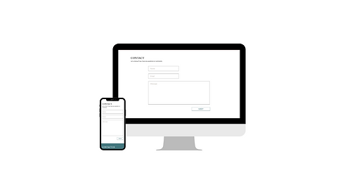
The Contact section communicates that user feedback is both valued and encouraged. Its placement on the landing page makes it easy for users to share thoughts, report issues, or request additional information, fostering a sense of community and ongoing improvement.
Footer Section: Quick Links
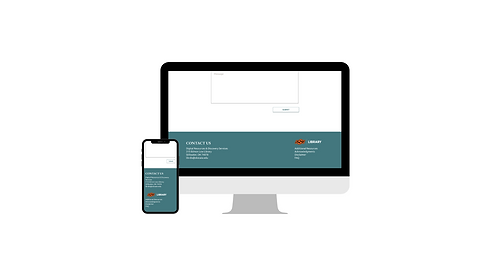
The Footer serves as an additional navigation tool, housing secondary information such as disclaimers, acknowledgments, and supplemental resources. By keeping less critical yet useful content here, the footer helps maintain the page’s visual clarity while still offering access to important details.
In Conclusion
Feedback & Metrics
Juliana wanted this project to be completed in time to be presented at the summit in November 2023. We made that goal, and the site was released with positive feedback.
Key Learning Experiences
-
Responsive design is essential—auto layout is a powerful tool once mastered.
-
Design isn’t just about the big picture; it’s about the details like interactions and hover states.
-
Stay organized throughout the process.
-
Design can look different once coded, so communication with developers is key.
-
Offering feedback can be challenging, but it’s necessary for improvement.

